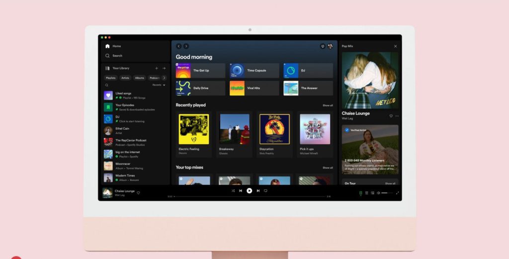
The Spotify app is often being updated, however not this time. Instead, the desktop version of the platform will be seeing change. A new Your Library and Now Playing redesign to improve the user experience.

What came first, desktop or mobile? The answer is desktop. For Spotify, their desktop music platform came about first, but since the mobile app came about, all eyes have been on that. It made desktop take a backseat as all new features being added were targeted towards mobile devices. However, now, Spotify have made some changes.
The new updates will see a redesign of both the Your Library section and the Now Playing area. Spotify’s main area will remain the same. Your homepage and browsing section won’t change. However, you will find new features added to enhance the desktop experience and allow it to reach its full potential.
After some research Spotify found that users appreciate the new Library section as it allows them to easily access their music, saving them time and making things more convenient. The Your Library section will be found on the left-hand side of the platform. This will be anchored there. It will allow you to easily switch between playlists.
Over on the right-hand side there will be a Now Playing area. This will show the song or podcast you are currently listening to. You’ll see information about the song, podcast or artist. Along with this you can see tour dates, and merchandise they sell. This makes it easier to connect with your favourite creators.
Spotify feel these changes add to a more personal experience. Allowing users to access their favourite content at ease. There is more information provided to the listener. The streaming platform has moved a previous feature. You’ll no longer see the Friends Activity feed where it previously was. Instead, you can access it via the friends icon by your profile picture.


