Many people use Spotify on their TV. Whether you’re looking for an easy way to play music as you do the housework, or, you’re entertaining guests. Having a sleek app with music at your fingertips can only boost the user experience.

Spotify has been a popular app on smart TVs for quite some time. There are many reasons people opt to listen through their big screen rather than their smartphones. It offers higher volume levels for a start, not everyone has access to the best quality speakers.
Not only that, but it’s often easier, especially with larger crowds to have music playing through the TV rather than trying to connect speakers with everyone wanting to input on the playlist. Spotify have suggested the new updates will make finding tracks even easier.
Spotify smartphone and desktop apps
Since the smartphone and desktop app have been updated recently, it seems only right that the TV app also gets the same treatment. Bringing them all up to the same level of quality will ensure all users are happy. Streaming stores often focus on smartphone apps the most.
This is likely because this is where most of their users are, but as mentioned it’s not ideal for the users who don’t reach for their mobiles. Spotify for TV is said to now deliver rich visual and audio, making for a much stronger user experience.
It will be easier than before to switch between accounts. Various users will have access to the TV app, so they will be able to see their home page, discovery feed and playlists from just a few clicks. It will give each member of the household full control.
Spotify have said the following
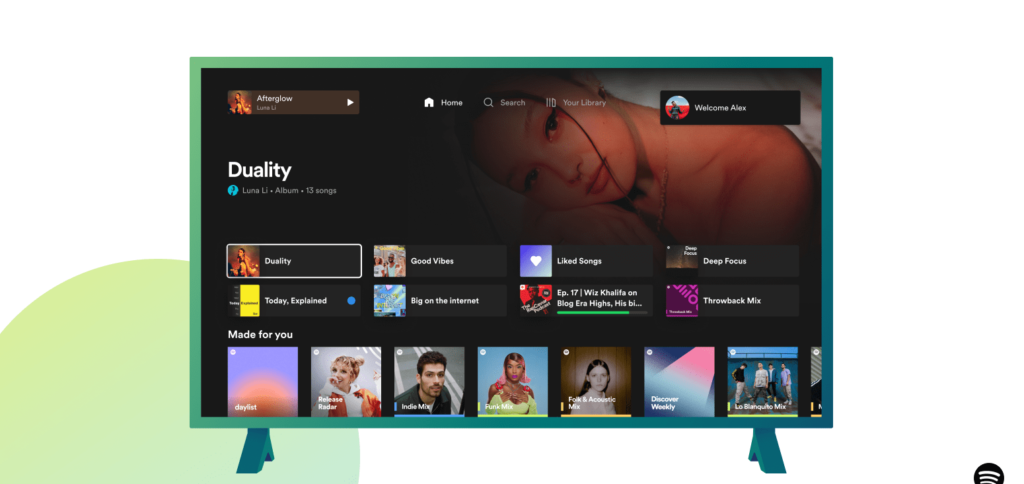
- New Home design: We’ve redesigned the Home page, bringing the big-screen experience in line with our Mobile and Desktop apps. You can now easily find familiar shortcuts to favorites, recently played audio, and personalized recommendations right on top of the Home page.
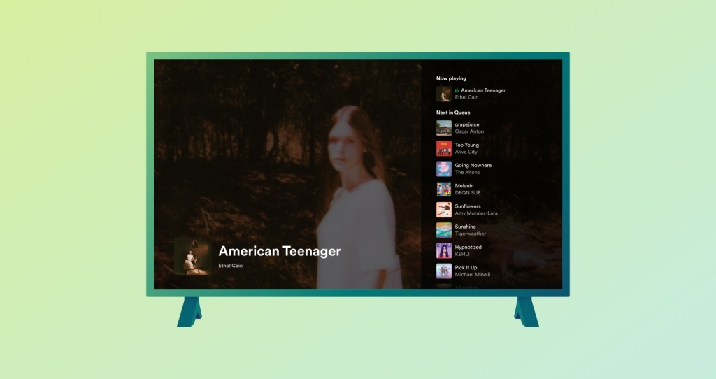
- ‘Up next’ listening queue: Previously it was only possible for TV listeners to view the next song lined up. Now, with the newly introduced Now Playing view, you can better manage your listening session by viewing and controlling what plays next through the easily accessible queue.
- Dark mode: For those occasions where the TV is not meant to be the center of attention, simply turn on Dark mode through Now Playing view. This will dim the screen and tune down the visuals to display a minimal amount of information so you can listen and still keep the mood.

Spotify are arguably one of the best streaming platforms for making regular updates and changes. They’re platforms are always adapting to give the best possible user experience and this is likely why they’re so popular.
Users can switch between profiles by clicking on their profile image. You’ll be able to display yourself as active, so your friends know when you’re streaming. Essentially, Spotify for TV is just like the smartphone app. The only difference is screen size.


