Brands, businesses, independent creatives, all have one huge goal in common. Their branding. Without strong branding, how will we know who you are or what you stand for? Your colour choices run deeper than picking your favourite colour and using it for all your marketing. You need to know what works, and more importantly, what doesn’t. Coolors is a free colour palette generator that will help you pair colours together.

What is Coolors?
Coolors is a free tool that allows you to choose a colour scheme that’s right for you. It will suggest colours that compliment each other nicely, and you can use this to market your brand or business effectively. We’ve previously spoken about how important colour schemes are within your branding. They’re not something you should overlook.
Having the wrong colour options could be a dealbreaker when it comes to your business taking off or not. This might sound drastic but colours effect everything. How we feel, the way we look at a brand. For example, having an ocean clean-up project who’s branding is black and red isn’t something you’d expect to see. Picking a blue palette instantly makes you think of the calm nature of the ocean.
Choosing various blues and softer colours makes you feel at peace. It’s more likely to have a positive impact. It also makes you think of the water and things related to it. Meaning you’re fully aware from the start what you’re getting involved with. It’s the same with a nature project, you want peaceful colours like greens rather than harsh colours.
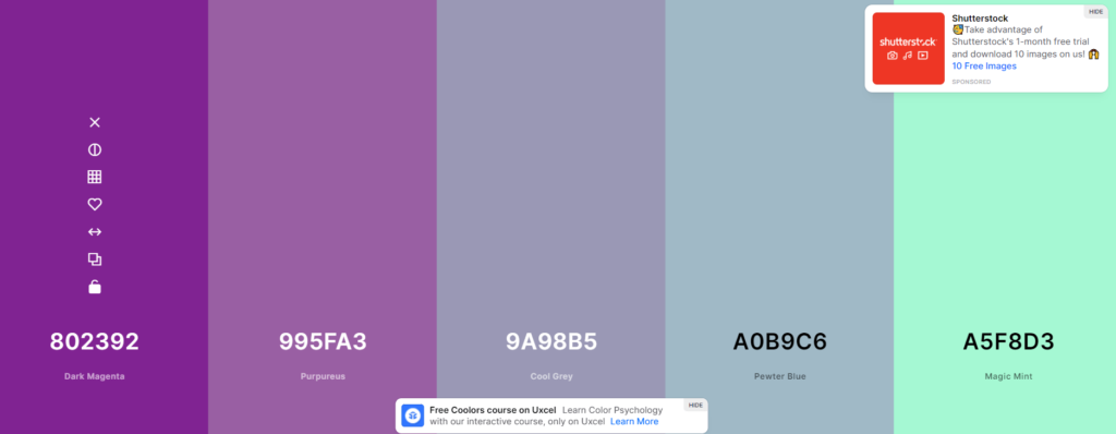
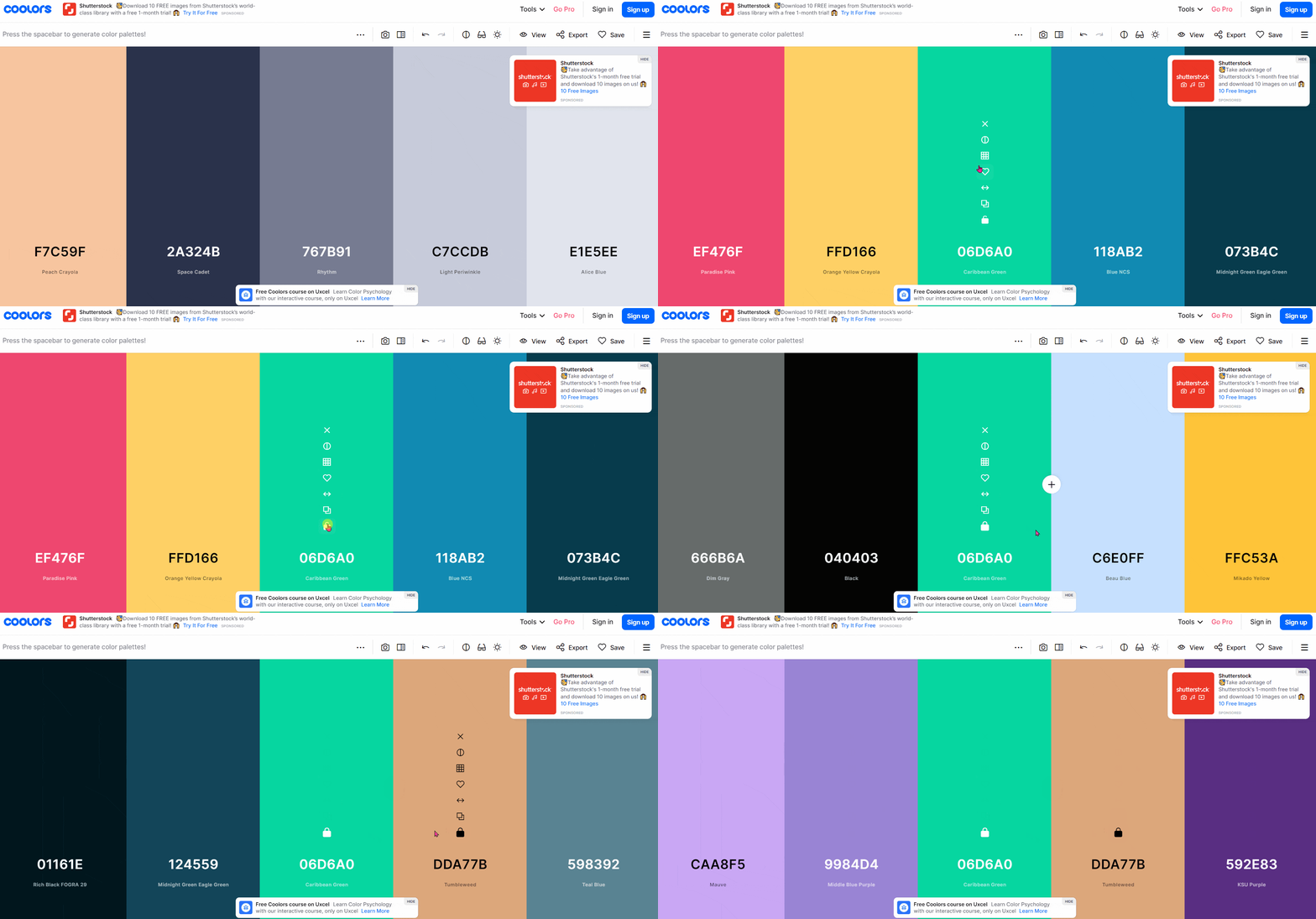
Coolors allows you to have random colour palettes suggested to you. You can then lock in the colours you like and refresh the rest. Allowing the website to choose colours that compliment your locked in choices. You can also select your own colours from the menu. So if you know an exact shade you’re looking for, you can type it in and go from there.
How can it help you?
You’ll be given a colour palette that works well together. Often people choose colours they like, but they don’t necessarily complement each other. Or, perhaps they match and work well together but blend too well. You want colours to work together but stand on their on. For example, baby pink and lilac might look lovely together, but they’re both soft, similar colours.
Your colours need to bounce off each other. If one is going to be text and the other a background, you need to make sure all audiences are able to read it. Many use white fonts on pastel backgrounds. Again, these colours look lovely together, but can everyone read what you’re trying to say?

It’s so easy to use. You don’t even need to sign up to access the colour options. You’re given the letter and number formations of each colour. Therefore, if you’re heading into a website like Canva to start creating your branding, you know exactly which shade you’re looking for. You can keep your image consistent. It will be exactly the same shade across all platforms you post to.
Multiple tools for each shade
Coolors allows you to lock in your favourite shades and then mix things up. That way you don’t lose the one you really like. Think about your brand and what message you want to send out when making the selection. You can add palettes from an image choice. So, you can upload your current logo and have a palette created around this. If you find one colour you think you like, you can explore the shades within this colour.
Hover over the tools on that colour, and you’ll see a square with lines running through it. This allows you to view all the shades that colour has to offer. You might find something more subtle or bold that matches you better. There are options to drag the colours around the page and see how they sit next to others. You can alter the contrast and brightness, so if a shade isn’t quite right, play around with it until it’s exactly what you’re looking for.
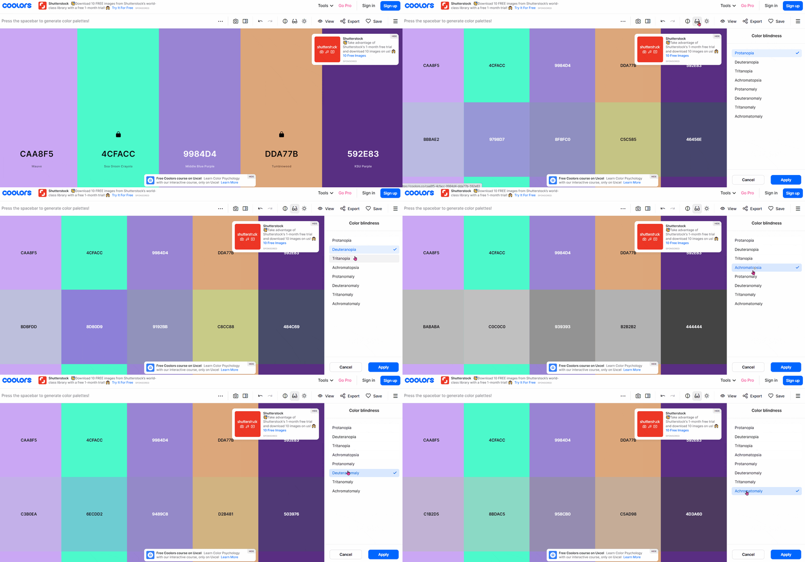
Possibly the best feature of all is you can view the colour scheme as someone who is colour blind. There are various types of colour blindness, and you can view it through the eyes of someone with each of these variations. That way, you know whether your font and background choices will be readable to all audiences. Looking at the GIF below, you can see that someone with Achromatopsia wouldn’t be able to read some of these colours combined. They become various shades of grey which wouldn’t allow them to see the font against the background.

How much does Coolors cost?
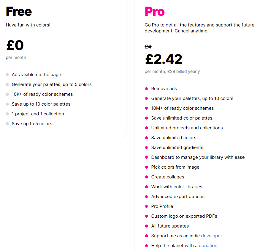
Coolors have a completely free option. With no catch, just completely free. You’ll get to generate palettes of up to 5 colours. Which, for many is plenty as a lot of brands and companies don’t stray much further than this amount. Too many and you start to lose the identity behind the colours. Your audience need consistency, and you want them to look at a colour and think of your company.
With the free choice, you’ll get 10k colour and shade selections. You can save up to 5 colours and 1 project. This option would really suit someone looking for their branding colour scheme. However, anyone wanting to create multiple brands colour schemes will need to upgrade. This could be for a freelance marketing executive working with various companies. Or, a business that need a large variety. Perhaps they have multiple projects they need to have individual colour palettes for.
Free or Pro?

For just £2.42 a month, or £29 a year, you could access their Pro subscription. This is a really great deal for anyone needing more than the free version allows them. It’s unlikely you’d notice the £2.42 payment being taken each month and if it’s bringing you in more clients because your marketing looks strong, then it’s worth it. With the Pro option you remove adverts. This is useful as often they pop up in the most annoying of places. You can add custom logos, save unlimited colours, access 10M+ colour schemes and have unlimited projects.
We’d really recommend giving this website a go. Whether you upgrade or not, it’s extremely beneficial. Give the free version a try and if you like it, consider upgrading to access even more. It’s something you can continue to add to and if ever you do need to create a new colour palette, all your previous work will be saved onto the system. You can cancel your upgrade at any point, there’s nothing tying you in. This means it’s a win/win for anyone thinking of trying it.


