It doesn’t matter if you’re a multi-national corporation or a start-up, single person brand; building visuals is a craft in itself.
The importance of cohesive brand visuals cannot be underestimated. Good brand visuals should communicate your brand personality, story and values all at once. They are often the first thing prospective audiences see and they will make or break first impressions.
Brand visuals are more than just a colour scheme, a font and a logo. They will take a lot of time, thought and experimentation. Read on to find out how you can get started building your visual aesthetic from the ground up.
Brainstorm
Start by sitting down and asking yourself:


The answers to all of these questions are fundamental to creating the right visual language for your brand. Compare these answers to your preconceptions of other similar brands and businesses and note down what you want to employ in your own visual language.
Dream board
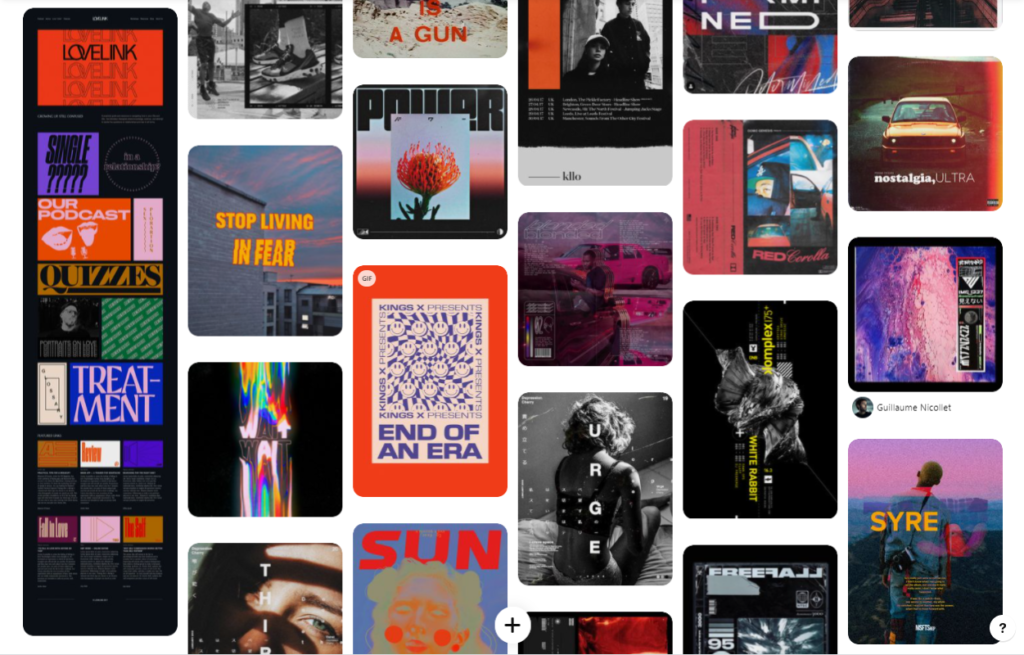
Start a visual pin board, using Pinterest or a similar site, to collate all of your ideas. Remember to include inspiration in your pin board for the following:
⏺ Logo
🎨 Color palette
✍ Font/typography
📸 Photography


This pin board should be your go to source of inspiration whenever you’re planning photoshoots, designing artworks or building your social pages.
Graphics
If you’re inexperienced or don’t feel confident, hire someone to design your graphics for you. However, there are hundreds of easy and accessible graphic design tools on the web. Designing your own graphics means you can spend as much time as you want experimenting with different aesthetics and styles. Furthermore, you’ll be gaining valuable graphic design experience that you can use for future projects.
Canva – perfect for designing graphics for socials, logos and album artworks.
Pexels – if you don’t want to use your own images, source beautiful royalty-free ones by a huge range of professional photographers.
Pixlr – edit your own images or design them from scratch within your browser.
Dafont – search through and choose a font to use within your branding (make sure your chosen font is free for commercial use)
Unfold – a beautiful app full of customisable imagery perfect for Instagram posts and stories.
Continuity
Remember to keep it consistent across all of your socials, pages and within your content. From your Instagram stories to your product artwork, there should be a common theme and visual aesthetic.
This could be as little as using the same colour palette, but it must be enough so that your audience can easily distinguish your brand visuals from others.
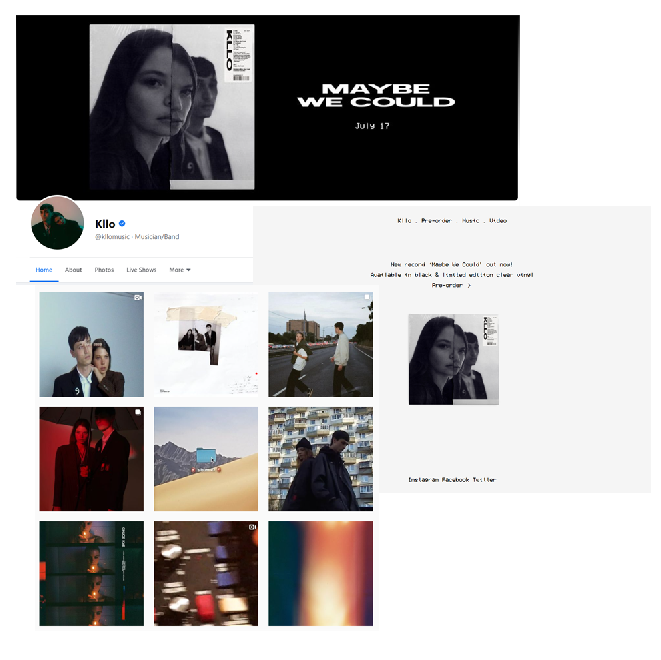
Australian duo KLLO effectively utilise 90s-esque, analogue film visuals across their socials, posts and website:
Tone of voice
Building your brand visuals can also help you decide on the tone of voice you take on your social media and when addressing your audience.
If your visuals embody a professional, mysterious tone then playful, excitable language probably won’t line up very well.
Just as in your visuals, make sure your tone of voice embodies your brand’s personality and values. Giving time and thought to this can really benefit your content in the long run.

