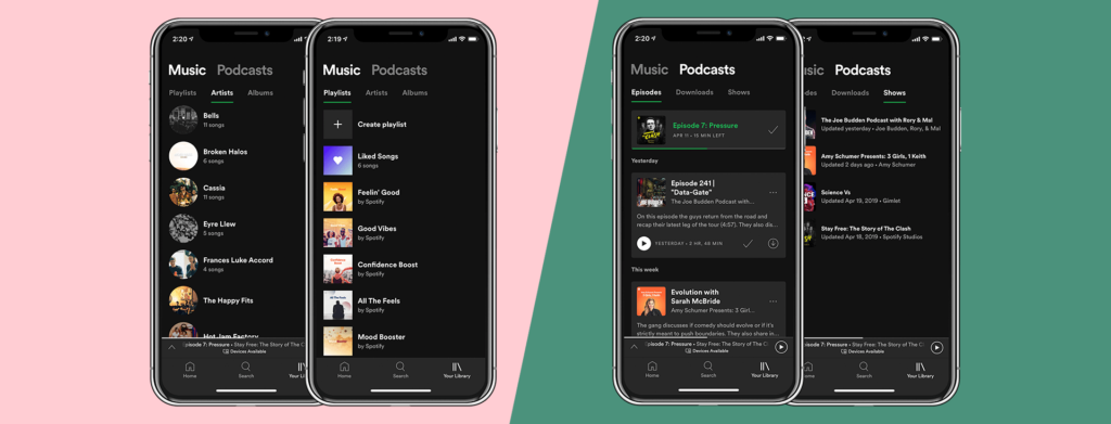
As listeners add more and more content to their library, finding that one track they want to listen to gets longer and longer. Spotify’s new exploring features mean users can find what they’re looking for in a jiffy.

On Thursday, Spotify started rolling out a new version of Your Library for all of their mobile users. Their new and improved design means listeners can quickly and efficiently find songs and podcasts from their huge libraries, no matter how long ago they saved it.
The streamlined design has introduced new ways of searching Your Library so users can easily explore all of their saved songs, albums playlists, and podcasts in a matter of seconds. These new organisational features means listeners can spend more time listening to and rediscovering the content they love.
Spotify’s new Your Library will now feature:


Spotify has already started rolling out this update to all iOS and Android users. If you’ve installed this mobile update, why not check it out yourself?
You can read more about this over at Spotify’s news room.


