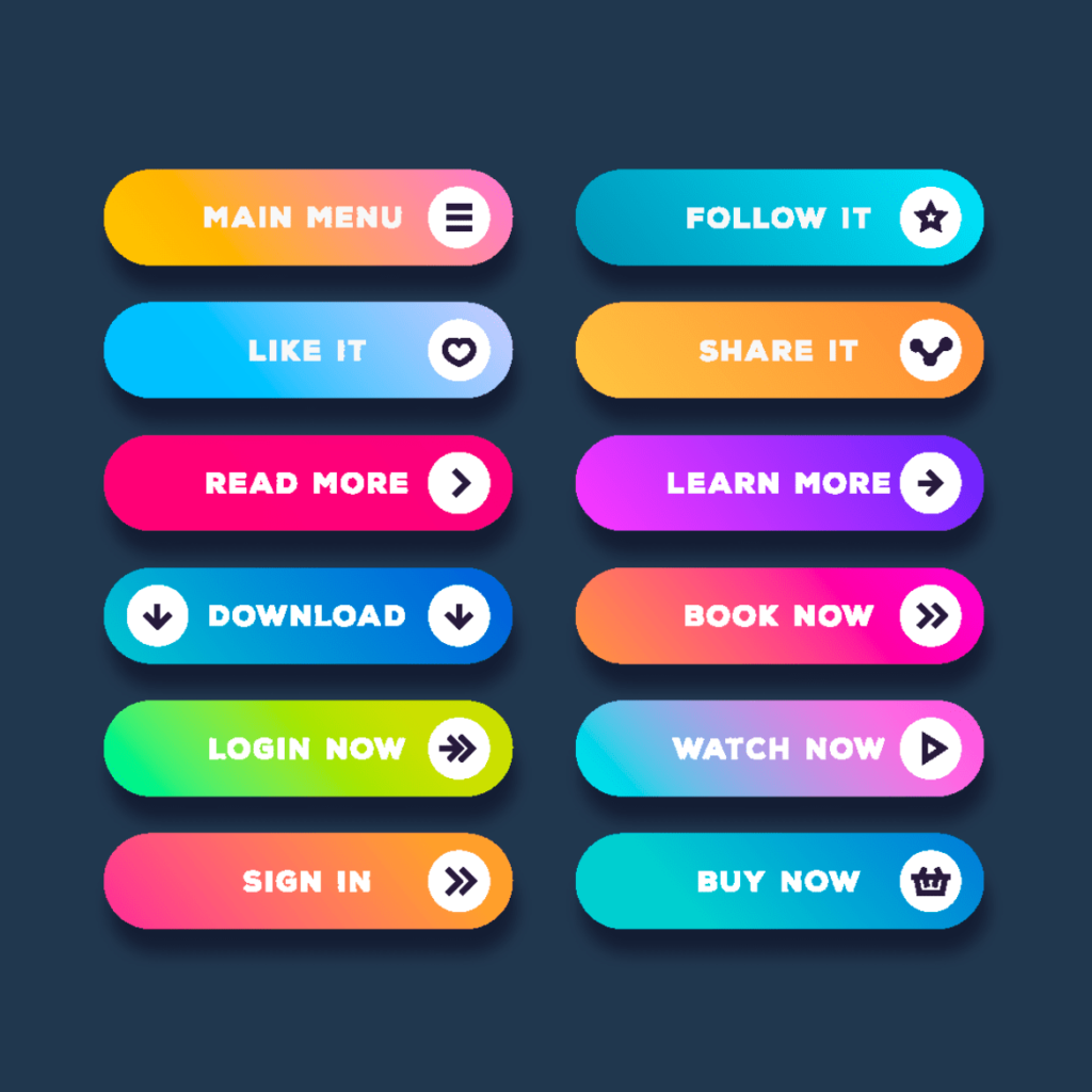
Have you ever heard of someone referring to buttons as call-to-action features? It seems a little confusing, because surely every button has an action? However, certain ones are put in place to draw people in and get them to act in a certain way. These are call-to-action buttons.

What is a call-to-action button?
To put it simply, a call-to-action button tells people what to do. If you’re an e-commerce store you might have an action button stating Buy Now. This encourages people to follow out the action. Usually the button will be a bright, obvious colour that can draw people in. Potential customers will see these buttons and essentially be told what to do. It doesn’t guarantee they will go ahead and buy from your store. However, it prompts them to.
Call-to-action buttons are everywhere. They aren’t just around when it comes to buying things. You could have a button to sign up to a site. On social media for example, you will see Follow buttons for every user. These are the exact same style buttons. They are prompting whoever visits that page to follow out a certain action. It is an easy way of getting to the end result. If you’ve already clicked on a store, you are clearly interested in the items. However, having a simple and bold button calling you in is likely to be appealing to many people. Possibly without them even realising.
How can you use call-to-action buttons?
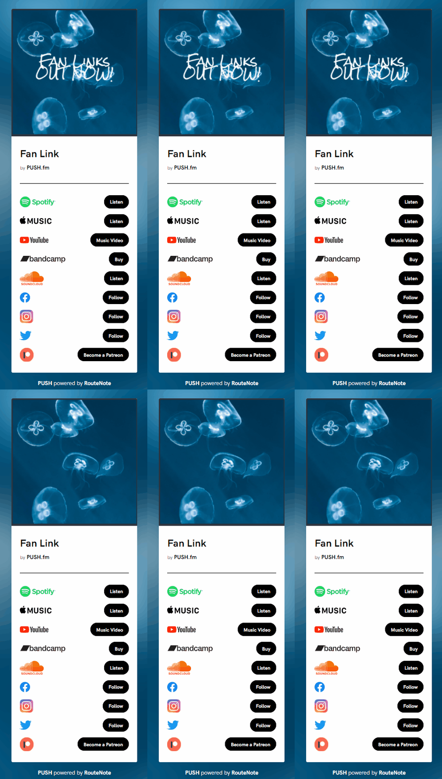
When you really start to think about the purpose of them, you’ll realise they’re everywhere. Using Smart Links through PUSH.fm means using call-to-action buttons. With every link you create you can edit what these buttons say. For example, if you’re including your YouTube channel within one of your links, you’re likely to put Subscribe as the action. Any streaming store links will also have a colourful button which states what action people should take. They’re all about drawing people in and allowing them to make decisions persuaded by you.

Notice how many call-to-action buttons there are above? All the buttons in black are explaining exactly what you should do by clicking on them. Of course, clicking Buy doesn’t mean you will instantly purchase something and be charged. But, it will take you to a page where you have the opportunity to follow through with a purchase. They’re essentially there to say, if you like what I have shown you, then continue further with the journey. The same goes for Follow buttons. There’s nothing to suggest you have to follow the person, but you’re unlikely to click on the call-to-action button without following through with the command.


