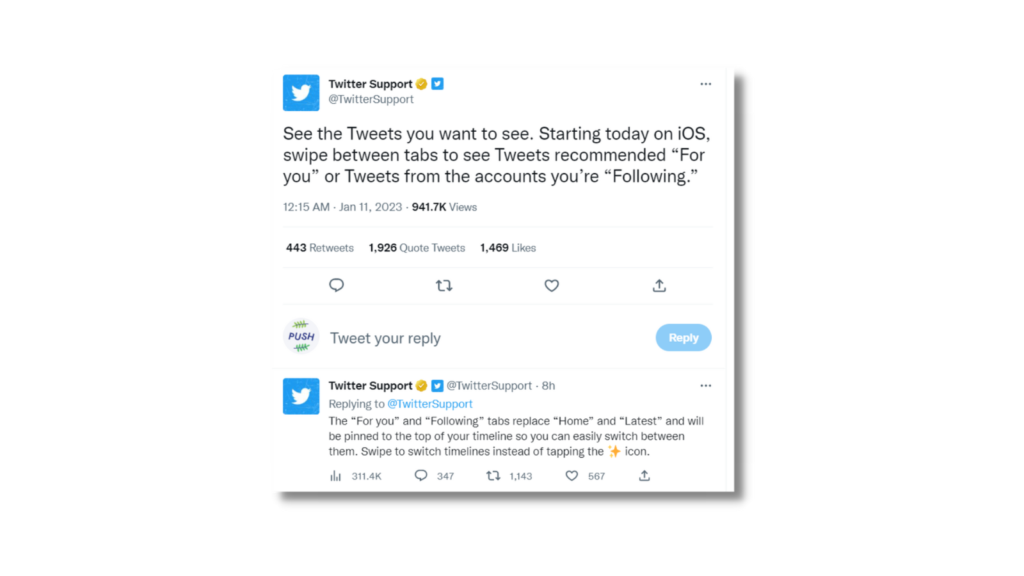
Twitter have changed the way you’ll view your timeline. Instead of tweets being shown based upon an algorithm, they’ll now be displayed based on your preferences. Users will have the option to switch between two tabs – Following and For You.

Twitter For You
Twitter has updated the way we’ll see our timeline. Instead of viewing other accounts tweets in an order decided by the algorithm, you’ll now have more of a say. Up until now Twitter would display tweets in either an algorithmically driven way, or a reverse chronological order. The algorithmic version would be the default option. This meant you weren’t seeing tweets based upon your preference, but instead, it was up to a computer and data.
The changes that have been put in place are first being introduced to iOS users. Android is likely to follow shortly. However, so far, there’s no news as to if or when desktop users will see changes. Within the updated version, users will notice the star button has been removed. This previously allowed you to choose between the algorithmic view, or the chronological one. Instead, you’ll see two tabs – Following and For You.
TikTok has inspired Twitter
For You will be the default option. This has taken inspiration from TikTok’s feed. The idea is, the more you interact with certain users, the more they’ll start to appear. Tweets will be shown in order of when they were uploaded, however, the more you show interest in certain tweets, the more you’ll see from those accounts. Twitter’s For You option will share tweets it believes you’ll be interested in.
Rather than scrolling to the top of your screen and clicking a button to switch between the different feed options, you’ll instead swipe. This means it will be easier to flick between your two home screen options. However, click off the app and back onto it, and you’ll automatically be shown the For You page. It won’t pick up where you last left off. Android and web users will still see the old view for now. But, it’s likely not for long.
What are your thoughts? Are you interested in these changes, or do you prefer the way Twitter currently is? The idea is to make the app more user friendly, by allowing users slightly more control over what they see. With TikTok, if you don’t like a video, you swipe past it, and you won’t see content similar again. Whereas, the more you watch of a certain subject, the more it will appear. So, it does make the user experience far more tailored to them and their preferences.


